A synthesis of function and aesthetics

Emotion _ functional und atmospheric
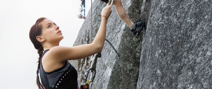
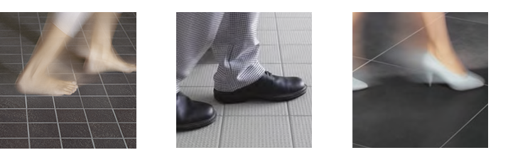
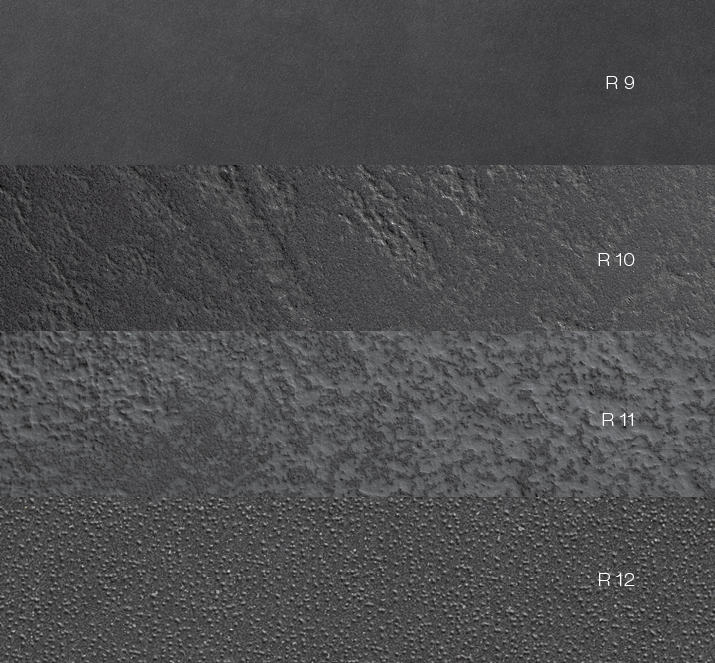
More and more, representative and functional rooms are not presented as clearly separated areas but rather as open room concepts. This applies, for example, to medical facilities as well as to shopfitting and gastronomic businesses. Wherever lubricants and greasy wastes harbour an extreme danger of accidents, specialised tiles with symmetrical treads prove their value. On the other hand adjoining rooms, in which customers and guests should feel comfortable, require a floor covering, which provides atmosphere and harmony in colour and material. With its system of formats, co-ordinated colours and non-slip grades (from R9 to R12V4), the Emotion series permits consistently aesthetic design – even in areas with floors subject to increased traffic.
Emotion _ durable and familiar
Natural stone structured in varying depths forms the fundamental concept of the Emotion porcelain stoneware series. The basis for the surface design is a distinctive, multicoloured slate from the northwest of Italy. This natural motif is transferred to the ceramic material step by step and in various reliefs, producing the three different slip resistant qualities. Their appearance ranges from severely rutted mountain rock (R11) to finely grained sandstone (R10) and through to the silky softness of smoothly polished stone slabs (R9).
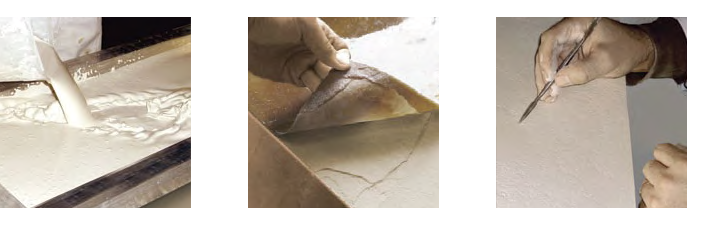
Emotion _ hand crafted and of lasting value
In keeping with the principles of high compression and hardness in mineral stone structures, the ceramic material is also painstakingly compressed under heat and high pressure during the manufacturing process. Textures and the finest of structural appliqués, as transfers of the original slate design, merge together into a fixed structure. During the course of further handcrafting new independent forms of expression are created. Thus the reliefs are also reminiscent of grained leather, tracks in the sand or rock. The colours in the series support these associations. Colours range from bronze, deep anthracite, basalt, grey-brown, mid-grey, light grey (GRIP only) to light beige. With its non-slip variants (available in all colours except bronze) and matching wall tile colours in sandy white, light beige and mid-grey, it offers a wide range of design combinations.
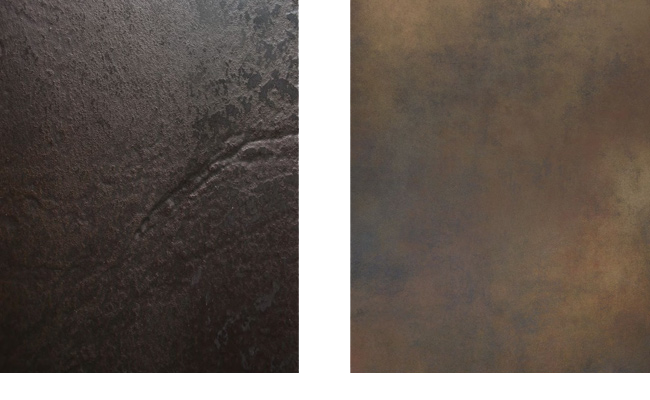
Emotion _ patinated and weather-beaten
Both decorative elements Rocks and Shades are created by the further processing and enhancing of the respective basic
tile and are thematically oriented towards its expression. Rocks is based on the relief structure: delicately coloured
metallic appliqués are burned in at temperatures of up to 1200° C and subsequently surface sanded with a diamond disc.
Shades corresponds with the delicate colour shadings in the smooth basic tile, which are reminiscent of patinated
surfaces with vibrant histories. Layered applications of colour tones with metallic accents heighten the impression of
oxidation and wear in an expressively designed decorative element.